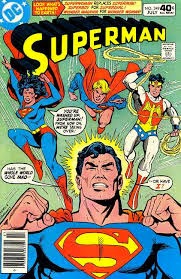
Utopia utilises the notorious comic-book aesthetics throughout the series unlike any other TV series, this composition of colours creates an ambience of futuristic change. As this colour combination is unorthodox, people find the colours quite disturbing, unsettling especially within the context of Utopia.
 The colour correction used in Utopia is extremely effective as it makes a clear contrast between the darker colours and the lighter colours.
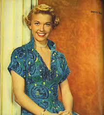
 Conventionally TV uses the colour palette of Technicolor's - greens, blues and reds but Utopia uses colours of magenta, cyan and yellows. Munden, the director of Utopia has been influenced by 1950 Doris Day films with the yellows and turquoises. The main influence was the elements of comic-book look. I believe they use the different colour palette to create a type of escapism, a visual representation of diversion.
 Within the post-production they use the grading software Nucoda Film Master. “As lenses and equipment get more sophisticated, film-makers are getting closer to a very ‘real’ look – but I wanted to do the opposite of that,” says Marc Munden.
He says that "he wanted to create a world that felt recognisable in its issues and characters, but also heightened and delirious.”
It was shot in Autumnal England, quite a bland, bleak time. Nature looks extremely bleak, this gives the editors a 'blank canvas' to create the ideal look.


